User Experience, Google’s indications in Quality Raters Guidelines
The user at the center: this is the focus on which to build our SEO strategies, especially in 2021 that will see, in a few months, the debut of the Page Experience Update, a concrete demonstration of what Google asks us to ensure on the sites – a smooth and fast browsing experience for our visitors. And within the guidelines for Google quality raters we can find interesting and useful ideas to be able to provide an excellent user experience on our sites.
Google Quality Raters Guidelines, a treasure trove of information
As we know, and as Maddy Osman reminds us on Search Engine Journal, the Quality Raters Guidelines are guidelines that Google has created in past years and periodically updates (the current edition is dated October 2020) to provide guidance to its quality raters, that is the large army of quality evaluators of the search engine’s SERPs.
These external contributors follow the guidelines to assess whether the search results shown by Google meet the requirements in terms of the quality of the information shared and the satisfaction of users’ needs. Being very detailed – the latest version brought to 175 the number of pages – they represent a sort of “direct line to Google’s thinking processes regarding high quality results”and so they can be a useful resource for all of us who are interested in creating pages that can be placed well.
Moreover, according to Osman “they also provide a lot of useful information on website and content optimization to ensure an exceptional user experience”, which is precisely one of the levers on which to force in this year.
2021 will be the year of the UX
This year will be (or should be) characterized by greater attention to the user’s experience on the pages of the site: the date we all expect is May 2021, when the algorithmic revolution officially starts that will make the Core Web Vitals and other experience signals of the page a new and official ranking factor on Google.
In a few months, then, there will be new technical criteria to be met to be competitive – although it is worth remembering, the factor that remains a priority is to offer quality and useful content, that really respond to the search intent: loading (Largest Contentful Paint), interactivity (First input delay), visual stability (Cumulative Shift Layout), or the Essential Web Signals, in addition to page speed, mobile friendliness of sites, safe-browsing, HTTPS security and absence of intrusive interstitial.
How to use Quality Raters Guidelines to optimize the user experience
All these signs of classification of the technical structure of a site have a trait in common, that is, ensure that the user experience (UX) is positive: the author notes that “the focus on the UX seems to be the point where the future of the SEO is going” and, thanks to a targeted reading of the Quality Rater Guidelines, we can have some valid guidance on what Google means by “good UX“.
- Interstitials and monetization with ads
For some years now – certainly since 2016, within a wider update of the classification factors to improve mobile browsing – Google has clearly expressed its aversion to the “intrusive interstitial“, and this theme often comes back to the center of discussions on user experience issues in the Guidelines for quality raters.
Let us immediately clear the field from doubts: Google does not ask us to completely delete ads from the pages of the site, but invites us to carefully evaluate the way to incorporate them.
In particular, explains Maddy Osman, there are several points in the document where this issue is addressed.
For example, in section 6.4 Google states the simple fact that “interstitials make it difficult to use MC (main content)”.
Much of the discussion about interstitial specifically revolves around the impact of popups on user experience, such as those used to collect email addresses. However, in the guidelines we are reminded that “the placement and quantity of ads can also be intrusive for the process of content consumption“.
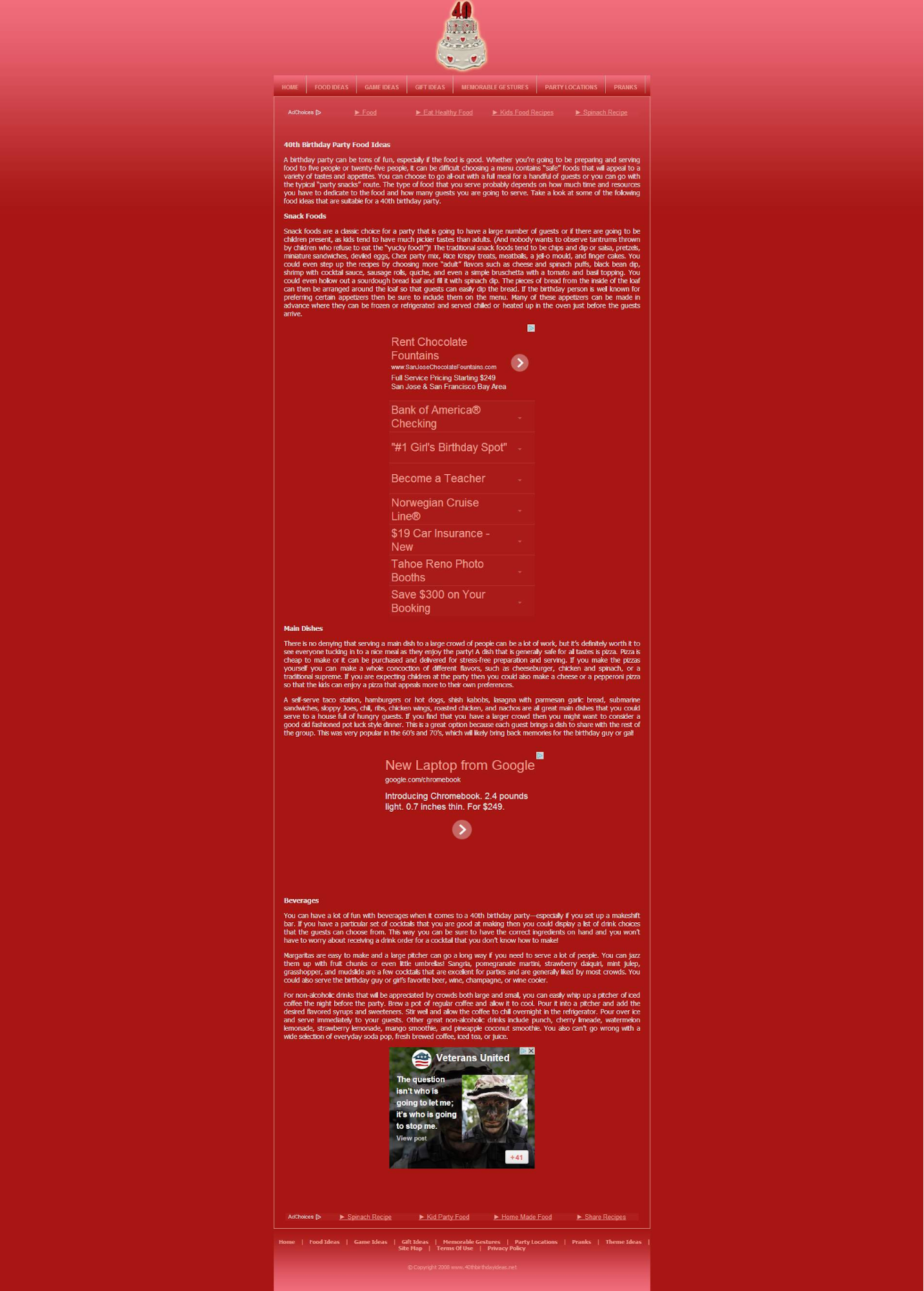
Again, in section 6.7 Google shares “an example that illustrates how too many/large ads damage the user experience“, indicating “that similar web pages should be awarded a low page quality score”.
This is an example of a page providing a bad user experience due to interstials:
However, in section 2.4.3 Google clarifies that “ads are not bad“, which can help create a good UX and that their mere presence does not constitute a motivation for a score of low or high quality, also because “without ads and monetization some sites and pages may not exist”.
- Setting of user expectations and clickbait
Several sections of the Guidelines for Quality Evaluators “focus on setting expectations for what people will see on the other side of their click-through”; with various examples, Google clarifies that “a good page defines expectations wherever you go”.
A clear example concerns the login to an online banking page, from section 5.4:
The following page respects all the indications and is evaluated with a high quality score, because “it has login functionality, clear information about what users are accessing and a good reputation deriving from being a famous and large bank” (that is, a high level of EAT for the purposes of the page).
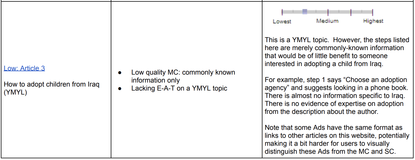
A page is good (also) if it meets expectations, reiterates Google in the document; in particular, in section 6.7 there is an example that “refers to an article on how to adopt a child from Iraq and why this page fails to adequately address the specific expectations of the reader” – that is, it does not give precise information to people interested in this topic.
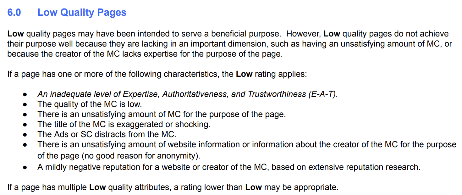
Very critical is (of course) Google’s judgment on clickbait titles, and in section 6.0 we read explicitly that “overly exaggerated or shocking clickbait titles belittle a high MC”.
A little further on, in section 6.2, Google adds “that each page should have titles, which should accurately describe the content of the page”.
We arrive at section 13.5 of the document (Needs Met Rating, the ability of the page to respond to the needs of users) where Google clearly states that “A result with a very misleading or exaggerated headline should be rated Slightly Meets or lower, due to the poor user experience that occurs when the target page does not match the user’s expectations when he clicks or taps on the result”.
So, better avoid overly clickbait titles if we hope to “stay in Google’s good graces”.
- Mobile usability
Much of the Quality Raters Guidelines “specifically focuses on the evaluation of mobile search results and special considerations to keep in mind for mobile users”, reads the article.
As a general rule, “people who use mobile search are even more impatient than desktop users and look for the fastest shortcut to an answer”; for this, “Google has optimized the SERP functionality to meet the needs of the searcher, sometimes at the expense of the content creator (in terms of searches without clicks)”.
Section 13.3.1 talks about the impact of usability problems on mobile devices (need to enlarge and scroll to navigate) with an example of the results for “broadway tickets”, positively evaluated because it leads to a reliable site and good navigability:
In the following section 13.5.1, Google shares a negative example of a user looking for Abe Lincoln’s birthday: although this information “both present on the page of the result provided, is not obvious / easy to find, and Google states that it is not doing a good job in meeting the needs”.
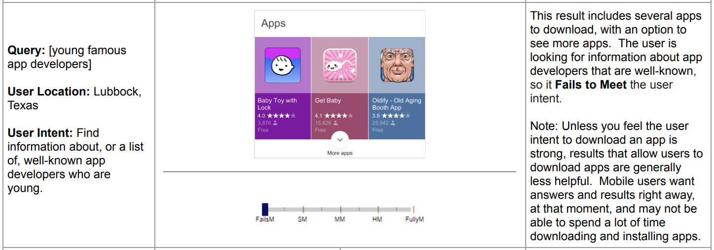
Lastly, in section 13.6.1 Google shares information about search results for mobile devices that suggest the downloading of apps, explaining that “Unless you believe that your intention to download an app is strong, the results that allow users to download apps are generally less useful on mobile devices”.
Mobile users “want answers and results right away, at the specific time, and may not be able to spend a lot of time downloading and installing apps”.
How to use Google Quality Rater Guidelines to improve the site’s UX
In conclusion to the article, Maddy Osman writes that “the guidelines for Google’s Quality Rater are a treasure trove of information“, although it is not always possible to find “the time and attention needed to read all 175 pages”.
In addition to providing important guidance for understanding how to create quality content, “there are also many cues worth paying attention to to create a great user experience on your website”.
In the year that will take us to the official entry of the Core Web Vitals among the ranking factors, thinking about the UX is very decisive if we want to continue to place our pages high in the SERP.
utenti mobili “vogliono infatti risposte e risultati subito, in quello stesso momento, e potrebbero non essere in grado di dedicare molto tempo al download e all’installazione di app”.


