Guide to the web page types that are fundamental to SEO
Every web page is important. In fact, we can say more: reasoning from an SEO perspective, every page of the site that is crawlable and indexable by search engines must be thought of, treated, and managed as if it were a landing page. Indeed, in the vast universe of the Web, each of the different types of pages has a specific role and unique potential to optimize organic visibility, but more importantly, they are critical to the structure of the site and to ensuring an optimal user experience. This is the assumption from which we start our analysis of the main specific types of pages that have the highest value for the fate of the project and must be the focus of any optimization campaign.
What are the main Web pages to be aware of and use on the site
Web pages were born with the rise of the Internet itself and have gone through a long evolutionary path in the way they are schematized, the way they develop, and the way we interact with them as users.
Indeed, thanks to this enormous evolution, we can now use web pages to read text, but also to watch videos, listen to audio, run applications, and even interact with other people. Basically, we can classify them into three major groups:
- Static pages: created in “pure” HTML, where only formatted text is shown.
- Dynamic pages: allow animations using style sheets (CSS) or alternative (and sometimes obsolete) technologies such as Flash and so on.
- Pages with Client-Server functionality: allow for fully dynamic pages and interaction with server applications built in languages such as PHP, Angular, NodeJs, etc.
Clearly, each site is unique, whether it has a purely commercial function or a creative soul so to speak, and the needs of visitors, as well as legal requirements, will vary accordingly.
The most common web page formats
Taking into consideration the function and characteristics of our brand that we intend to promote, we can identify at least 11 types of page “formats” that might serve our organization, each of which serves a specific and independent function. Depending on the nature of the site, as also recommended by the experts at Swapps, we can consider selecting only one type of web page or combining different formats, assessing what is most useful, necessary or suitable for the specific type of activity or occasion, and whether these pages will then be linked to a Web site or will be stand-alone (Web pages and Web sites are two different things).
- Portfolio pages: a creative way to showcase work done through digital portfolios, in which to upload multimedia elements and not just images.
- Blogs: as we know, blogs are very popular as they allow people to share knowledge and can serve as a repository of opinion information, as well as allow monetization through various systems.
- E-commerce. E-commerce sites or online stores allow people to sell products in a more organized way, and to support more product flows and content, a robust Web site should be created.
- Event Web pages: in the case of some social events, whether family events or those open to a wider audience, it is common to provide a single Web page with information about the event itself, such as conferences, events, weddings, as well as gatherings on special dates, brunches, academic meetings, or simply special business meetings.
- Forums: open spaces for sharing specialized information, usually bringing together like-minded people who express themselves more or less freely – it is the “prince” place of user generated content.
- Personal web pages: are used to display clear information in a more creative way, uploading resumes, biographies, employment information or content on a specific topic related to the subject.
- Landing pages: these are the classic landing pages, especially useful during digital marketing campaigns, and usually feature calls to action, registration forms, specific event information, images or animations, with very timely and accurate information.
- Subscription Web pages: allow an exchange of content, services or products through a visitor’s membership or contact information; usually a page linked to a Web site, allowing site owners to create larger digital communities or have more control over their audience. They are used, for example, for reading groups, magazines, or monthly delivery products.
- Nonprofit Web pages: provide relevant information about the organization and its events, and can be useful for promoting fundraisers, attending events, signing petitions, presenting specific cases, or simply disseminating information.
- Informational web pages: are used to disseminate information of interest, such as digital encyclopedias, news like newspapers, and spaces that showcase do-it-yourself (DIY) projects and do not have the main goal of obtaining financial benefit.
- Web media pages: allow different text formats to be used to add value to the information on the web page, such as to showcase an important article, thesis, or research that is the responsibility of different parties, with easily accessible information. In addition, this type of web page is used in the arts to display projects.
What are the most common and useful types of web page on a site
Changing perspective and thinking instead in terms of a “site,” there are other types of web page that we may need and need to learn about and use. We can recognize at least 19 of them, as suggested by Magezon, which represent the essential forms of Web pages to be mastered for SEO as well.
- Homepage
- About Us
- Contact
- Category Page
- Product Page
- FAQ (Frequently Asked Questions) Page
- Blog
- Blog categories and tag pages
- Privacy Policy
- Portfolio
- Testimonials – Reviews
- Terms and Conditions
- Sitemap
- Affiliate Pages
- Job offer pages (Careers)
- 404 Error Pages (Page Not Found)
- Registration / login page
- Shopping cart / checkout page
Every useful page of the site is a landing page (or so it should be built)
It is definitely the task of an SEO professional to determine which pages have the highest value, and therefore the highest earning opportunities, at any given time in the digital marketing campaign; but, as explained by Stoney deGeyter on Searchenginejournal, It is important to treat all useful pages as if they were a landing page, devoting them all the attention necessary to optimize them and make them yield.
And if a page is not useful, adds the expert, it is better to block it to avoid that the search engines index a page, so as not to waste our time and resources and bots.
Characteristics of a good landing page
But what does it mean that every page must become a landing page? To understand this, we need to refer to the features that make a good and efficient landing page, which relate to design, usability, conversions and so on. In principle, a well-built landing page:
- It captures the attention of visitors.
- It answers to their needs, desires and requirements.
- Answers important/ relevant questions.
- It makes users want the solution we provide.
- Guide users to perform a particular action.
- It pushes users to take action.
Looking at the complexity of the sites, then, we can apply a reasoning similar to all useful pages, which can and should be treated as a landing page. To be precise, according to deGeyter “no webpage is outside the scope and competence of the SEO”, because “if the page is relevant to the visitor, it is relevant to the SEO”.
But it is clear that not all pages are the same, although for the definition of useful we can identify three basic features that a page must possess:
- Have a purpose
- Attract an audience
- Guide visitors to different goals.
Key site web pages for SEO: what are they and how to optimize them
After defining the framework, then, we can find out which are the 19 types of web pages to which every SEO professional must pay attention and the reason for doing so, namely those that are usually the most important pages for an optimization campaign.
- The home page
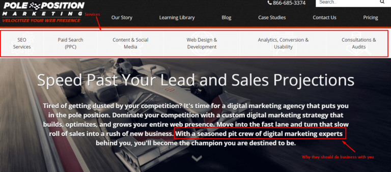
It is impossible not to start from the home page, which is usually one of the most visited individual pages of any website and, equally often, the first page viewed by a visitor when they search for our brand. Indeed, to put it better, the homepage is the gateway to a website, and so it should be eye-catching, clear and well-organized, with good optimization of loading speed, able to provide a preview of what the site has to offer and guide users to the most important sections..
However, one aspect should not be overlooked: whether you land directly on the home that reaches it through an internal page, a visitor will always have certain expectations about what he will find.
In general, the home page should provide an overall view of what the site offers; that is, it should offer visitors the “general picture” of the products and services we offer and why they should do business with us.
So, the home is the door through which the visitor enters and begins the journey in our site, where you will find more details about what we offer.
According to the author, many SEO professionals make the mistake of “trying to optimize the home page for the company’s main product or service“, but this strategy can be fine if our company focuses on a single product or service.
But when we offer something outside the scope of a single product / category, such home page optimization becomes irrelevant.
And so, the best and most sustainable strategy to optimize a home page is to focus on the brand, so that it is the first result on the search engine for branded queries, surpassing any other competitor.
However, ranking is not the only reason to optimize this page, because an effective home page also increases click-through and user engagement, and to reach the goal we have to ask ourselves about some points, such as:
- What do users see in search results?
- Does it push users to click on the site?
- Once visitors have clicked, the message they see is right and gives them a reason to delve deeper into the site?
Part of our job is to analyze how any page of the site behaves: if the home page fails to keep visitors on the site, it means that there is much to do to solve the problem. Basically, however, the standard for a good home page is to provide a quick overview of who we are and what we do, a summary of products and services, and possibly some bullet points on how we might assist the potential customer or user client.
- About us page
The “about us” or team page is crucial for showing information about us, our business, what we do and what we offer visitors, and is the perfect place to explain to visitors how we differ from our competitors.
Several studies show that visitors who viewed the About Us page on a site are more likely to convert than those who do not; such statistics, according to deGeyter, can demonstrate a symptom or a result (or, probably, both).
The symptom is that to check the page about us are visitors already close to conversion, which then make a further step before committing and completing the process. The result, however, is that visitors who visit an About us page are strongly influenced by its content and are more likely to convert if the page meets what they wanted to learn.
In any case, what we need to evaluate is that the About Us page is an important part of the conversion process and is useful to drive traffic, that is the reason why – no matter how “bizarre” it may seem – it is important to optimize the About Us page, including taking advantage of the many keywords that are fit for purpose.
In particular, any keyword related to the industry or product that are qualified with company, business, agency, office company or other similar keywords are virtually perfect for the about us page, where they find the right context (while it is difficult to use them properly in any other place). More generally, content should be placed on this page that provides a comprehensive summary of the brand, including the history of the company, possibly including the staff and team, any relevant achievements made, and the originality of the proposal compared to competitors offering a similar service.
- The Contact page
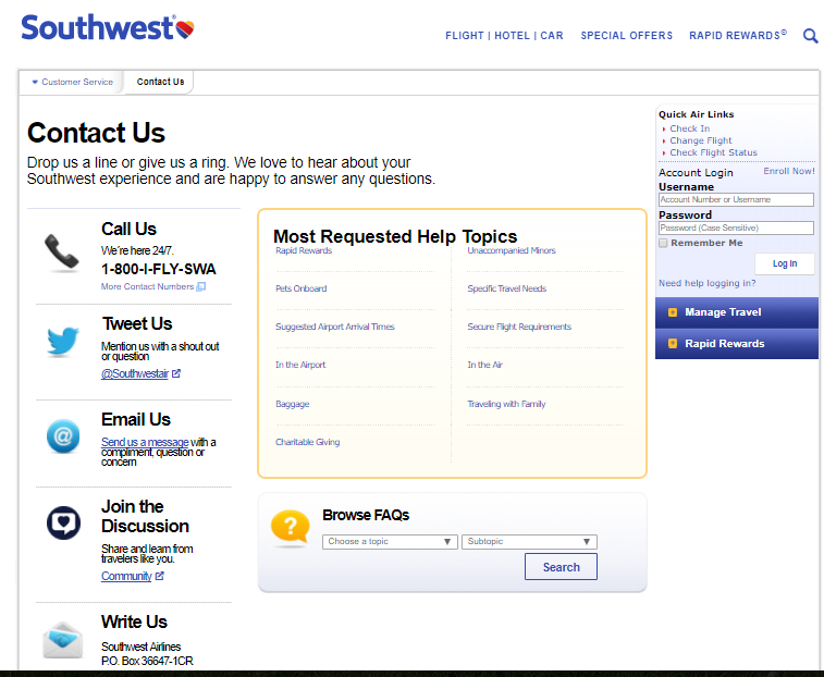
Displaying contact information can help establish an emotional connection with visitors and increase people’s trust in our brand; from a practical standpoint, this page should list all the ways potential consumers can reach us-although it might be helpful to provide the cell phone number, e-mail address, and mailing address in the footer of each Web site page, if possible.
There is basically only one reason why a visitor intentionally navigates on a Contact page, that is, search for our contact information, which they will then use to get in touch (precisely) through one of the possible ways between email, telephone or chat, or to know where the activity is located. And this last option is the most important for optimization.
Many customers prefer to “do business with someone close” and, even if the local business is not our daily bread, there is no reason to ignore it, so it is useful to focus the optimization efforts on the position, for example:
- Find the keywords used by users that are most relevant to our area.
- Integrate the maps in the contact page.
- Use the schema markup on address and phone number.
Basically, it is crucial to be able to make it as easy as possible for visitors to contact us and it is important to monitor the level of engagement of the Contact page: if too many users visit and do not commit, could mean that the process is complicated as it requires too much information or is simply wrong and does not provide the right directions.
- Category and sub-category pages for products
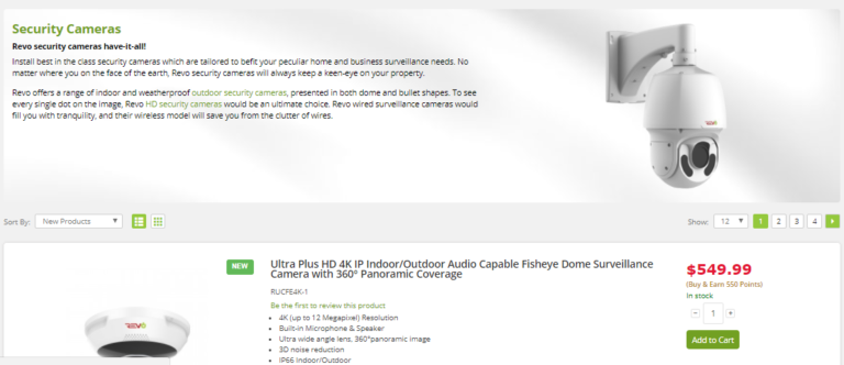
Category pages help organize site content in a logical and intuitive way, grouping similar products or content and making it easier for users to navigate; from an SEO perspective, they can help search engines better understand site structure and index content correctly.
Even more, the optimization of the pages of the categories and subcategories of products offers great SEO opportunities, because in the purchase cycle are those most frequently displayed by those who are in the shopping phase, that is, those visitors who have a good idea of what they want, but are still trying to learn more about the options available to them.
These pages are used to give the visitor access to those options, which are usually represented by the product details pages.
In many cases, “product category pages are nothing more than pass-through pages: visitors can frequently revisit the page, but only to pass it on to the products”.
On an SEO level, these pages can be a gold mine of optimization: the keyword “treated typically are not so extensive as to lose all the value, but not even so specific as to lose all the search volume”. At the same time, however, they present some problems.
Product category pages “need content in order for them to be optimized, but visitors to these pages do not want content, they just want to see products”.
In fact, it is necessary to find the right compromise between these elements: that is, not to present too much content that “push the products down on the page”, because visitors must see the products without scrolling so as not to misunderstand and think that it is an informative page, and in any case take care of the contents, which play a valuable role in the conversion process.
There are many ways to add content to pages without hiding the products and without dispersing their quality, and what matters is to be sure to give all visitors what they need.
- Product pages
The product pages are fundamental in the sales cycle, since a shopping user will often dwell on such content: when they arrive, it means that he has collected enough information to know precisely enough what he wants and what he needs.
It is in a point from where he is “only observing the smallest details and deciding which version of the product he wants and from whom to buy it”, and allow our site to provide information about the things we sell, so as to definitely lead the person to conversion.
When it comes to optimizing product pages, keyword research “becomes almost irrelevant”, deGeyter says, “because there are so many variables that it is impossible to focus the content of these pages on any potential variable in any traditional way”.
Paradoxically, this makes the optimization of these pages much easier, because it pushes us to work less with keywords and more on the content construction.
As with any page, we need to start working on tags: title, description, alt text, heading etc; where most other pages require a custom approach, however, in the case of product pages we can optimize mass easily and in through the dynamic insertion of keywords.
We can also write “boilerplate content that can be used for all products in a specific category”, taking care to enter the product name in the appropriate location (although a unique content is always preferable).
In addition to this, we need to make sure that the page contains the relevant types of information, and it is here that keyword research becomes valuable, to help us not so much in the search for specific words, but for the types of information. To give examples, in the article we read that “if people look for colors, make sure the information is on the page; if they want sizes, put them; if they look for product numbers, yes, add those too”.
This does not mean that you need to optimize for a specific product number shown by keyword research, but that we need to “optimize for product numbers, period”.
Also important is the way we make these pages accessible, which can have a huge impact on SEO: “the more links there are toward the product details pages, the more link authority we draw from the other pages”; but it also means that we provide more link authority to such pages, which are often the ones that convert the most.
The meeting point “could be to have lower rankings in the category pages instead of higher rankings in the product pages or vice versa”, choosing what we need best overall.
- FAQ page
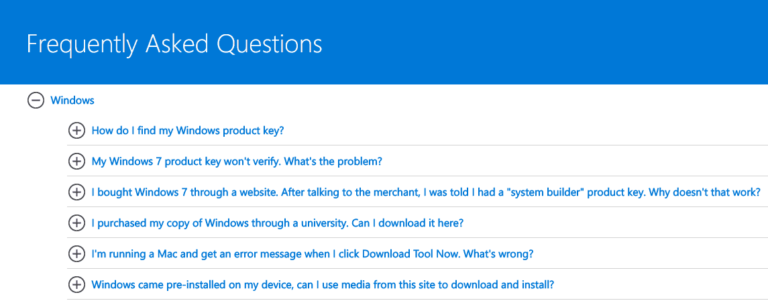
Having a frequently asked questions page can help you find the right information at the right time. To optimize them, we need to make sure that we can identify the questions that users really ask and properly answer.
The FAQ page is also an (other) excellent place to disseminate important information about the company by summarizing what visitors want to know through the creation of specific questions and answers, which can also help support save time from having to answer the same questions repeatedly.
- Blog and blog posts
Every site has a limit to the number of pages that can be added before it becomes excessively cluttered and begins to interfere with the conversion process, but “there is almost no limit to the number of relevant topics for which you can optimize pages,” and this is where a blog with its articles or posts comes in.
A blog, in fact, provides a space for us to give our company a voice, to tell our experience, share knowledge and interact with consumers and readers.It is a powerful and cost-effective marketing tool that can generate visitors, leads and sales-according to a HubSpot report, 57 percent of companies that write blogs have received a lead as a result of their efforts.
Any topic that we cannot explore – or cannot explore accurately – on the main site can be explored in detail in a blog post or series of blog posts.
Each blog post can be targeted to meet the needs of a specific searcher and be used to drive relevant traffic to the site. But attracting visitors to the site is not enough: each blog post must contain call-to-actions to our site.
This does not mean relentlessly promoting our products and services with each post, but “providing a kind encouragement to direct readers to get more information”.
- Blog categories and tag pages
Every blog should have categories into which each post should be placed, but we also have the option of tagging posts with keywords to which they are relevant, so as to give readers a way to use categories and tags to find more related content.
According to deGeyter, such category and tag pages “can be great landing pages in their own right” if we insert optimized text that stays at the top and leave the blog posts to fill in the rest of the content and do their part for readership and ranking.
This work provides an additional opportunity to rank queries that we may not have chosen to target on the main site, but care must be taken not to duplicate optimized text on pages after the first for each category or, if not, keep those pages out of the search index so that they do not devalue the text itself.
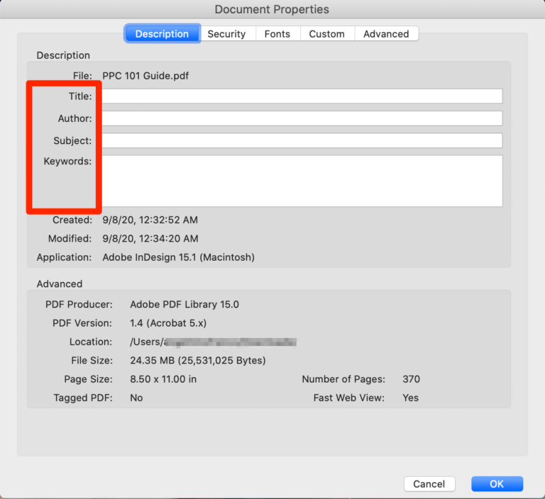
Technically, PDFs are not web pages, but can be a way to provide “valuable information to visitors, albeit in a different format”.
PDFs should be used sparingly and only after having optimized them; the optimization process is different from that of the other pages, but the concepts are the same: we must insert the identification data of the document (title, author name, topic and keyword relevant) and make sure it’s accessible to users.
- Privacy Policy
The Privacy Policy page is a key element of any website: it informs users about how their acquired personal data (e.g., advertising, cookies, e-mail, etc.) is collected, used, and handled, and is required by law in many jurisdictions-for example, in Europe, especially following the GDRP. On the practical side, it helps build trust with visitors by showing that the site takes data protection seriously, provided of course that it complies to the letter with what it says.
- Portfolio
The portfolio page is where a company or professional shows their previous work, taking advantage of visual forms to demonstrate their skills, abilities and experience and provide visitors with a concrete idea of what they can expect. This page can include completed projects, case studies or any other work that highlights the quality of the service provided. As the saying goes, a picture (and even more so a video) is worth a thousand words, so demonstrating concretely what we are and do, instead of just talking about it, can be good strategy to convert visitors into customers.
- Testimonials/Reviews
Testimonial and review pages are a powerful social proof tool because they showcase the positive experiences of previous customers and reinforce the company’s reputation, especially when traced back to a legitimate source that generates authenticity and trust (for this reason, it may be appropriate to include titles, locations, and full names, and possibly even an image of the review author or testimonial). These pages can have a significant impact on a visitor’s decision to choose the services or products offered.
- Terms and Conditions
The Terms and Conditions page provides detailed information about the rules and guidelines for using the website. This page may include information about copyrights, return policies, terms of sale, and more. It is an essential element in protecting the company from potential legal disputes because it details the “rules” and “terms and conditions” that a user must agree to in order to access the website and its proposed services.
- Sitemap
As we know, there are two types of sitemaps, static and dynamic. XML sitemaps are used to organize information and created primarily for search engine bots, which can more accurately and quickly discover the content of the main web pages. HTML sitemaps, on the other hand, help “human” visitors find their way around the site by providing a specific index page listing all the main pages on the site, with direct links.
- Affiliate Pages
Affiliate pages are used to promote third-party products or services. When a visitor clicks on an affiliate link and takes an action (such as a purchase), the site owner receives a commission. These pages can be an effective way to generate extra revenue, but if we monetize in this way, it is mandatory to flag affiliate links with a disclaimer, to alert users each time that a link on the site generates a commission-it also applies to endorsements, sponsorships, and other similar opportunities.
- Job opening pages (Careers)
Job openings pages provide information about career opportunities within the company. These pages can include descriptions of available roles, requirements, benefits, and information on how to apply, and can be a good way to attract talent and professional figures on target with the company’s needs.
- 404 Error pages (Page Not Found)
404 error pages are displayed when a visitor tries to access a page that does not exist. Although they may seem negative, a well-designed 404 page can turn a frustrating experience into an opportunity, guiding visitors to other parts of the site.
- Login page
The registration/login page is where visitors can create a new account or log in to an existing account-it is critical for Web sites that offer customized services or sell products.
- Checkout
The shopping cart/checkout page is where visitors review their selected items and complete their purchase. This page must be simple, secure, and intuitive to maximize conversions and reduce cart abandonment.


