How to improve the Cumulative Layout Shift for visually stable pages
It is a frustrating experience to say the least: we start reading online content when, all of a sudden, the page skips like hundreds or thousands pixels and makes us completely miss the point we were at, or maybe we try to tap on a button and a popup appears in its place that we involuntarily press, taking us to an unwanted page from which we desperately try to go back. These are two examples of (terrible) layout shifts, that can cause difficulties to the user experience: it is no coincidence that Google has included the Cumulative Layout Shift among the metrics of the Core Web Vitals, and now guide us to measure and optimize this metric to improve the use of our pages.
Cumulative Layout Shift or CLS: what this metric means
The in-depth analysis is curated once again by Patrick Kettner, Google’s Developer Advocate who had already dedicated videos to the management of the other two Core Web Vitals, with advice to measure the FID and to optimize the LCP.
In the new (and last) episode on Youtube of this series we focus then on the Cumulative Layout Shift or CLS, a parameter that helps us to understand how stable a page is or, more precisely, how predictable is the use of a page.
All the visible parts of a page and the way they fit together, Kettner explains, are what a browser considers a layout – images, text, videos, everything. When the content of a page changes, for example when an advertisement is inserted, a widget is loaded, or an image is changed in size, Sometimes things that are already visible on the page end up being moved elsewhere to make everything fit and “every time this happens there is a change in layout“.
The cumulative layout shift is thus a way of determining how much of the visible parts of a page, in percentage, experience these variations in layout.
An example of CLS
In the video, the Googler brings the example of a simple blog article, which shows on page a title, a main image and text. For users who browse from a slower connection, the text appears right away, but the image takes a little longer to appear, although eventually it will be downloaded and opened.
However, before the pixels of those images can be painted, some changes may be required.
As for the browser, everything that is above the image is in place and you do not need to change anything, but in order for the image to appear in the place and the way it was conceived, everything below it must move down to make room for it.
Cumulative Layout Shift of a page, Google’s tips
Quindi, il testo dell’articolo viene letteralmente spinto in basso per metà della quantità visibile della pagina per fare spazio all’immagine: ciò significa che il 50% di ciò che possiamo vedere inizialmente deve essere spostato solo perché l’immagine appaia, e quindi il CLS sarà 0,5 – ma solo se nient’altro si sposta sulla pagina o se l’utente esce dalla pagina prima che qualcos’altro modifichi il layout, perché altrimenti il CLS sarà peggiore.
In sostanza, pertanto, il punteggio CLS di una pagina indica quanto cambiano le parti visive della stessa, ma Kettner ci spiega che ci sono alcune precauzioni e aspetti da non trascurare.
- There can be only one CLS score
Each time someone visits the site, the browser will continuously track the CLS throughout the time of use, and when the user leaves the page or closes the tab will report the greatest CLS value found. This single number is collected with that of all the other visitors to that URL and generates the CLS value for the vitals Web on that page.
- Sometimes change is positive
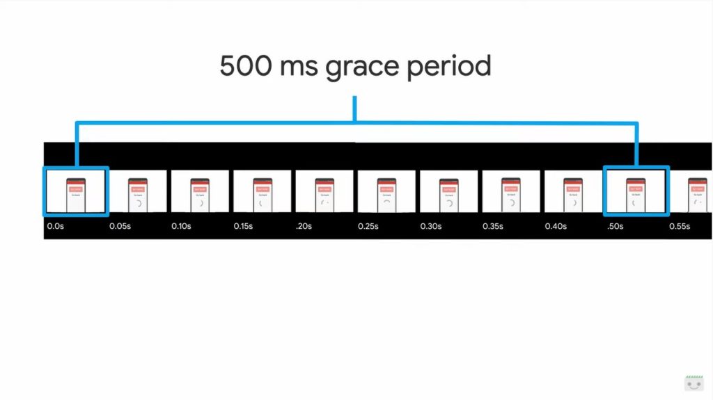
“If pages never change, they wouldn’t be so useful,” Kettner explains: some layout changes triggered by user interactions – things like touching, clicking or typing – have a grace period of 500 milliseconds in which to perform any layout change they need to best respond to that user. After these 500 milliseconds, a new CLS session window begins: from the 501 millisecond onwards, any content shift that occurs is added and potentially used for a final CLS score, and this session window will remain open as long as there are visible layouts that are moved.
Any additional movement is added together: for example, another page of our site has a basic layout, with a title and a body of text, but this time has two smaller images that, as in the previous case, are slow to load and move the content when they appear. The first photo moves the layout only by a small amount, by 5% and then its CLS would be 0.05, but the second image is loaded several hundred milliseconds later and needs some space, pushing the content even further down, for a visible quantity of 2,5%. These two events take place in close times and therefore the variations are accumulated in a single CLS value, which is 7.5% or 0.075.
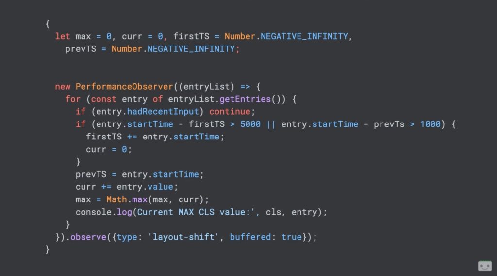
The session window, in fact, remains open until more than a second has passed since the last layout shift, or until five seconds have passed since the creation of this session window: any subsequent layout change is counted as a separate event and not added to the previous window.
- Not all interactions are free
User interactions such as scrolling or mouse movement do not count as the type of events that open the grace period of 500 milliseconds, because in fact “a user cannot expect the layout of a page to move while it is scrolling”.
- Not all changes are negative
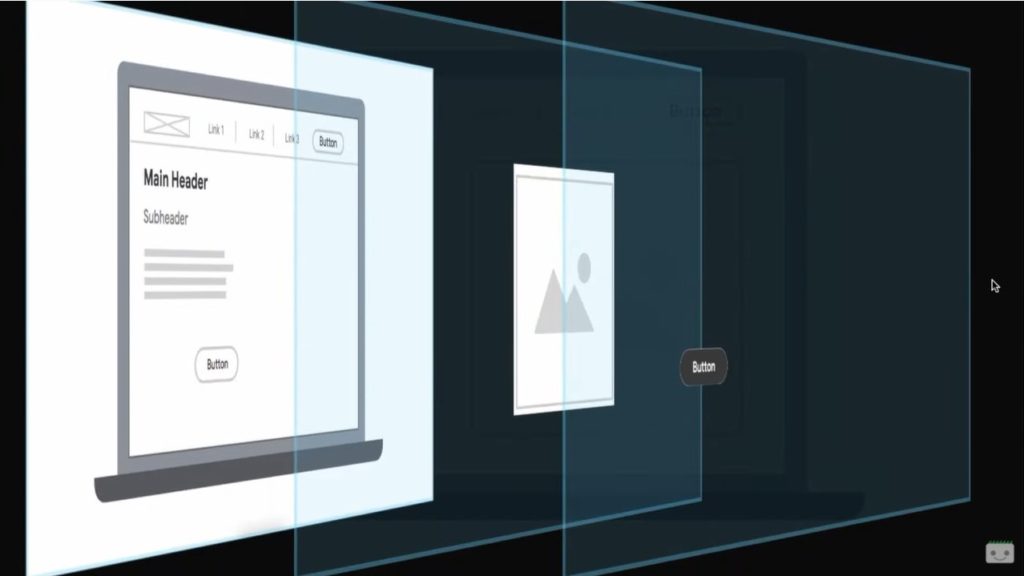
It is possible to freely move the content of the page at will via animations and CSS transformations.
By setting a CSS attribute as transform, the element is moved to a specific layer and its position does not affect the layout of any other part of the page, but “it is as if it were floating on top of everything else” and does not count for the CLS.
- What we cannot see cannot hurt us
The CLS only applies to the visible elements of the page and, for this metric, “it doesn’t matter if something moves that you can’t see”. Respecting the philosophy of the Page Experience, the CLS serves to ensure that people have the best possible user experience: therefore, we can move something or put content in lazy loading “if it is not visible to the user” and without influencing the CLS.
CLS scores: how to measure them and which ones are the good values
There is one key thing to remember: a good CLS score means that what the user sees is stable and predictable and that it is not jumping all around.
From a practical point of view, the CLS is represented by a number between 0 and 1, with the 0 representing the perfect score “in an ideal world” because, for the Googler, “there is almost never any need for a layout shift and we can almost always prevent them”; however, in the real way “we all have a job and our sites are facing tons of different concerns”.
So, if reaching 0 is almost impossible, “a very good number to bet on is 75% or more of the views on a page that has a CLS of 0.1 or less,” says Kettner. If we manage to stay below this threshold, the pages offer a stable visual experience, while if we exceed those values there are some methods to improve the situation and reduce the CLS.
How to measure the Cumulative Layout Shift
As with all Core Web Vitals, the CLS indicates “what real users are experiencing when using our site”, showing information that is defined as field data, which you can find in personal analytics or metrics within the Core Web Vitals section of Search Console.
Console search, factors for the Page Experience and Core Web Vitals all have the same source for the CLS outcome of the pages, namely the Chrome User Experience Report or CrUX, which presents anonymized metrics on the performance times encountered by actual users visiting the site Urls.
By its nature, Crux does not update instantly and “may take up to a month to publish the page to begin to sound data in the field”.
Luckily, you don’t have to wait that long to get an idea of how CLS behaves on the page we’re working on, because we can use tools like Google Lighthouse, that quickly provides the same field data that we have in Search Console for any page or allows you to generate lab data.
Laboratory data is an “attempt to guess in the most likely way how the field data will be”, are based on average mobile devices and the average speed of the Internet from mobile; however, remain a hypothesis, may be useful to point us in the right direction but “field data is the only value that the experience on the page, and therefore the Search, will actually look at”.
For example, if our users have high-end devices or unusually slow connections, there is likely to be a strong differential between laboratory and field data values.
The analysis of CLS with Javascript
Lab data can be really useful, says Kettner, but after actually publishing the page is “a little more useful to actually collect CLS data through our analytics“, and in particular through the measurement with JavaScript through the performance observer also used for other metrics.
Performance Observer is a relatively new API browser that allows you to subscribe to events happening in the browser related to performance.
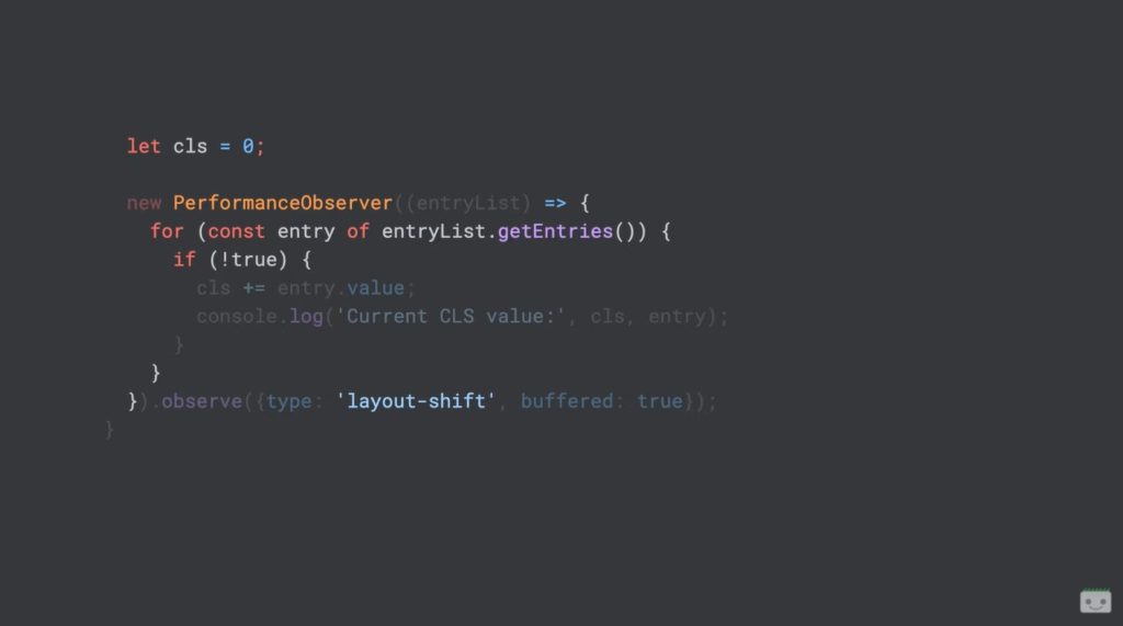
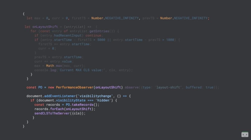
We do not have the ability to directly observe the cumulative layout shift value, but “we have all the right pieces we need to find out for ourselves”: the first step is to subscribe to the performance event “layout shift”, so that our code is called each time the browser has an event to change the layout and understand how the CLS will be for this user.
When our feature is called, it gets an entry list of each layout variation that has been observed: we can call Get Entries on this entry list to get an array of entries to be repeated on each individual entry, and then again check if an entry had a recent input (HadRecentInput, a convenient property provided by the browser on each shift entry layout).
If “HadRecentInput” is true, then we are in that first window of grace of 500 milliseconds and we can ignore this entry; on the contrary, if “HadRecentInput” is false, we must take entry.value and add it to our CLS.
Originally, the CLS was calculated by summing up the entire session of a page, but as a result of the feedback received and the continuous evolution Google changed the metric and chose to use the methodology of the session window – we talked about it here, as well. To calculate the CLS to the extent it is intended today we must then add other variables to our JS code, as shown in this image.
Now that we know how to collect CLS value, “we still need to trigger an analytics event“, but the way we do it depends solely on our infrastructure, while the when applies to everyone.
The browser has another event, called visibility change, which is activated every time the visibility of a page changes, such as when it is reduced to an icon, closed, or you browse elsewhere (in another tab or window, for example) and allows us to expand our code to include reporting.
If the visibility status is hidden, we can call take records on our Performanceobserver: we will then have a list of all the entries that were not processed by our code, and we can then process each entry just as we normally would, to then call sendCLSToTheServer – a completely invented function that we have to implement to make it work on our site.
The only weirdness left in our code, continues Kettner, “is that to ensure that the CLS is always sent when people leave the page, we are using the visibility change event”, which potentially risks sending more analytics events to the same user (for example, a user who has our page open, but then changes tab, and goes back, and then again, and again, sends more events to the server each time the change takes place).
Therefore, you will need to filter these values on the back-end to get the greatest value for each user session, remembering as said that there can only be an Cumulative Layout Shift value.
How to improve CLS scores
To improve the value of the Cumulative Layout Shift we must first understand what causes negative variations to the user experience and, according to the video, these layout changes “can be traced back to a handful of causes”such as images that do not have inline dimensions, iframes or embed that do not have inline dimensions, dynamically injected content that does not preserve space with explicit dimensions and finally web fonts or icon fonts that cause a flash of unsharpened or invisible text.
Layout shifts: the most frequent causes of issues and how to solve them
Images are the main source of problems with CLS, says Kettner.
Remembering the above example, an image that does not include a width or height attribute, either in line or with its own CSS, should actually be just a placeholder note, something that is completely different from the size it will have at the end of loading, and that causes the content to jump, triggering a displacement of the layout.
The solution to this problem is very simple: explicitly include the height and width attributes of our image. Such “attributes have existed for decades and inserting them was a common practice, but with responsive designs and high-definition screens setting these values has become less useful than using CSS or letting the browser understand them by itself”.
Currently, all modern browsers make automatic sizing of the resource based on the aspect ratio (aspect ratio), that is how wide an image is divided by how high it is according to the values of width and height. This means that “we can still model the image using reactive values such as width 100% in our CSS”, but at the same time the browsers automatically reserve the correct height based on the aspect ratio of the width and height that we provide.
In addition to being a good solution to manage the appearance of images on all devices, this will also prevent images from triggering the CLS, because you will not see changes in layout, even if the image is loaded on a slower connection.
Another critical front are iframes and embed, which “can mean a lot of different things like advertising slots or widgets for a video player”; in practice, anything we upload from another domain or other services is likely to be loaded into an iframe or embed.
We can’t control what happens inside the iframe, says the Googler, but we can control what happens around it: just like our images, we need to reserve a space that will be occupied by the iframe. By setting explicit heights and widths for the iframe parent element, the browser reserves space for it, thus preventing any layout shift.
Sometimes, the ad network that provides ads for the site does not need the right size for its slot, which could be too large a couple of pixels: Kettner therefore recommends explicitly setting Overflow Hidden on such parent container iframes to make sure they do not exceed the measurements in an unexpected way. But if we need to be sure that every single pixel of an ad is visible, we need to oversize the parent container slot and modify our design accordingly to take it into account and make it look good even if the size is larger. In addition, it is also useful to avoid collapsing advertising slots when no ads are returned, because the removal of all that space will cause as many annoying variations in layout.
Not all dynamically uploaded content is in iframe, though: if our site has a list of articles or pages of endlessly scrolling products, or if we simply put any kind of content in lazy loading, We must always be sure to reserve the space that will serve with an explicit height and width.
Just like with iframes, if all goes well the server should return something of this size, but theoretically “our pages are designed so as to be flexible enough to handle content larger or smaller than expected”.
And so, set a flexible but immutable width and height and height on the remote resources of our page “is the key to a minimum CLS score”.
Management of web fonts for the CLS
The above examples of potential causes of high CLS can be solved simply by “making sure that all rectangles have explicit dimensions that do not change“, Kettner summarizes, but what if the content within those rectangles changes?
This is why web fonts pose a unique challenge to CLS, because we can’t explicitly set a width or height on text, and so to solve the problems of a web font or font of icons that cause the layout to move, we need a different approach.
The simplest solution is not to use the font. In the case of icon fonts, it is actually much better to directly use SVG today, because “not only do they have a significantly improved design capability, but they give much less problems in modern browsers and are also substantially better for accessibility“.
But if a web font causes the layout variation and we absolutely want to use it, then we need to optimize the way the font is loaded. In short, a great starting point is to use the preload for all the fonts we are really using: usually, web fonts are loaded asynchronously (lazy load) and then the browser downloads HTML, any Javascript and CSS before starting to download and process each font face declaration that we declare within that CSS. Link rel preload is a kind of suggestion that we can give to the browser to get it to start downloading the font before it finds out in the normal way, so that it will be ready much faster when it is discovered.
In addition, these essential fonts must be put as close as possible to the top of the page, to give the browser as much time as possible.
Instead, if we choose the web font for an aesthetic issue, we can alternatively use font display: optional, a property that we can set in a font face declaration, which supports some different values and which, optionally, tells the browser that the font is, in fact, optional. In practice, setting this value, if the web font takes more than three seconds to load the browser will give up trying to load it, and will only show anything that has already been rendered. So, no more changes, no more movements of content.
When we are already looking at a font-based code, we have to check that we have not already used font display: swap, which does more or less the opposite of optional: font display swap tells the browser to immediately show any existing fallback font and then replace it with the font we are requesting as soon as the download ends, regardless of the time it takes to download it.
If we use a web font that is slow to load onto a substantial part of your page, “we can imagine how big your CLS score can be if we use the font display swap”, Kettner concludes.


