How to check Page Experience factors, Google’s advice
Page Experience is the new set of indicators launched by Google to measure the way users interact with a web page, beyond its purely informative value. In summary, it is an update that drives us to ensure that people who use our websites, pages and web applications get the best experience we can offer them, and to do that we have to respect some metrics and measurements. A new Google video guides us towards this goal, indicating the best ways to check if the site meets all the experience factors of the page, including those outside the Core Web Vitals.
How to check the Page Experience factors
To guide us in this activity is the new episode of the Getting Started With Page Experience series on Youtube, in which the Developer Advocate Patrick Kettner offers information, advice and ideas on the subject.
The first concept to learn is that the Page Experience “is not about cutting-edge code techniques or something like that”, but “it’s about making sure that a person who wants to see your site can do it easily, quickly and safely“.
Starting on last June 15, the release of this important update officially ended on September 2, as announced by Google on Twitter. To be precise, in the chirping we read that “The implementation of the experience on the pages is now complete, including updates to the carousel Top Stories from mobile”.
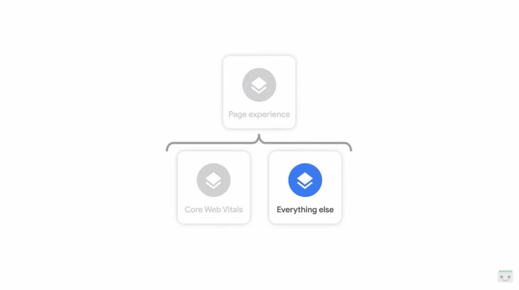
Coming to practical aspects, Kettner clarifies that we can think about the experience on the pages as the set of two categories of ranking factors: Core Web Vitals and all the rest, remembering that the individual metrics and measurements will be reviewed and updated annually.
Google’s tips to offer a good page experience
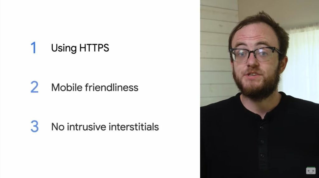
Specifically, this video omits the 3 CWV and focuses instead on the other aspects that make up the framework, and in particular instructs the SEO on how to verify compliance with criteria of mobile compatibility, use of HTTPS and lack of intrusive interstitials, considered all essential elements to give a great experience on the site. As you can see, the list no longer shows safe browsing, officially removed from the factors at the beginning of August 2021.
Kettner’s lesson focuses on how to confirm and monitor the progress of our pages for each of these factors.
How to check the use of HTTPS on the site
The first check is on the actual use of the HTTPS protocol on the pages of the site, a direct check and rather simple to perform.
If the site uses HTTPS, we pass the check; otherwise, we fail.
Kettner also invites you to confirm that rel=”canonical” is set to the HTTPS version of our domain, and especially to ensure that all non-HTTPS traffic is redirected to HTTPS versions of URLs.
Why HTTPS is a Page Experience factor
The video also clarifies the reasons behind Google’s decision to include the presence of HTTPS among the factors constituting a good experience on the pages. It may seem a bit odd to use a security certificate for any site, especially if you are not using private user data or financial information,” admits Kettner, but “enabling HTTPS for your site prevents any information your users access from being modified by a man in the middle attack, as well as increasing user privacy from any potential interceptor that may exist on their network”.
Moreover, he reminds us again, “SSL certificates no longer cost an arm and a leg”, but thanks to projects like Let’s Encrypt we can “quickly enable HTTPS for the whole site 100% free”. Let’s Encrypt is a project that has existed for years, “driven by some of the best privacy and security researchers from around the web, and has the support of Mozilla, Google, EFF and many, many others”.
How to check mobile friendliness of site pages
More complex the answer to the criteria required for compatibility with mobile devices – mobile friendliness – which refers to a specific list of problems that cause negative experiences to users browsing from mobile devices. These aspects are fundamental for everyone, especially since the use of the Internet has largely shifted to smartphones and other mobile devices, and Google Search introduced as early as 2016 a metric to measure mobile friendliness and the actual functionality of content on such devices.
Kettner reassures us: if our site is already built with a modern and responsive design, it probably meets all the criteria to be optimized for mobile devices.
In short, Google checks that the text is not too small to read, the links are not too small to touch and there are no obvious signs of a lack of optimization for mobile devices. These items are increasingly important, as mobile web traffic continues to increase and has long since surpassed desktop traffic.
So, even if our site is focused on the desktop, the Googler suggests, it is better to implement “typically quick and simple changes that are needed to make it mobile-friendly and offer a greatly improved user experience for all users, regardless of their device type”.
Corrections to prevent frustration of users
Among the basic interventions mentioned are the setting of meta viewports, which makes sure that the content is resized to the right size when people open the site, and a minimum height and width for links and other pluggable elements.
These optimizations, which will probably require the assistance of a developer, can prevent user frustration and create a smoother browsing experience throughout the site.
Other interventions on compatibility with mobile devices may instead require more work, such as the removal of obsolete plugins such as Flash or Quicksilver, which are now obsolete and almost universally replaced with safer and protected web standards.
The video reminds us that we can quickly check whether specific site URLs meet Google’s criteria via mobile optimization test (mobile friendliness checker), while through the Search Console we can control the entire site and be notified automatically of any problems that may pop up.
How to manage intrusive interstitial ads
The last aspect of the factors of the Page Experience extra-Core Web Vitals is the absence of invasive interstitial ads, or to simplify “the absence of annoying popups“, because – as Kettner says – “popups are terrible and nobody likes them”.
At the moment, there is no automated tool to warn of the presence of these elements, but if our site uses automatic popups we are probably already aware of it. Usually, adds the Googler, “they are found on sites that have sloppy advertisements or are intentionally deceptive with their user interfaces”.
In general, Google recommends avoiding covering the entire page with something irrelevant; Users should not be required to close an interstitial before they can interact with the page and ads on a page should not disturb what a user is trying to achieve.
Obviously, there are some types of ads that are accepted, especially legal interstitials such as privacy policies or cookie notifications, or login requests to the site and access to paywall content in subscription: These are types of legitimate use cases for interstitials, positively recognized by Googlebot, which therefore should not cause any problem to the site.
Basically, the rule is to provide content that organically fits to the page and do not interrupt what the user is trying to do on the page itself.
The check of AMP pages
The final part of the episode is dedicated to sites that use AMP, the technology that (among other things) allows to reduce the technical load in tracking and dealing with all these individual controls.
Probably, in fact, if our site uses AMP pages has already positively passed these checks and therefore responds effectively to the requirements of the experience on the pages. For added security, in addition to the tools mentioned, we can use the specific link to check AMP pages – Page Experience Guide – developed by the AMP team to report and find problems on any AMP page.


