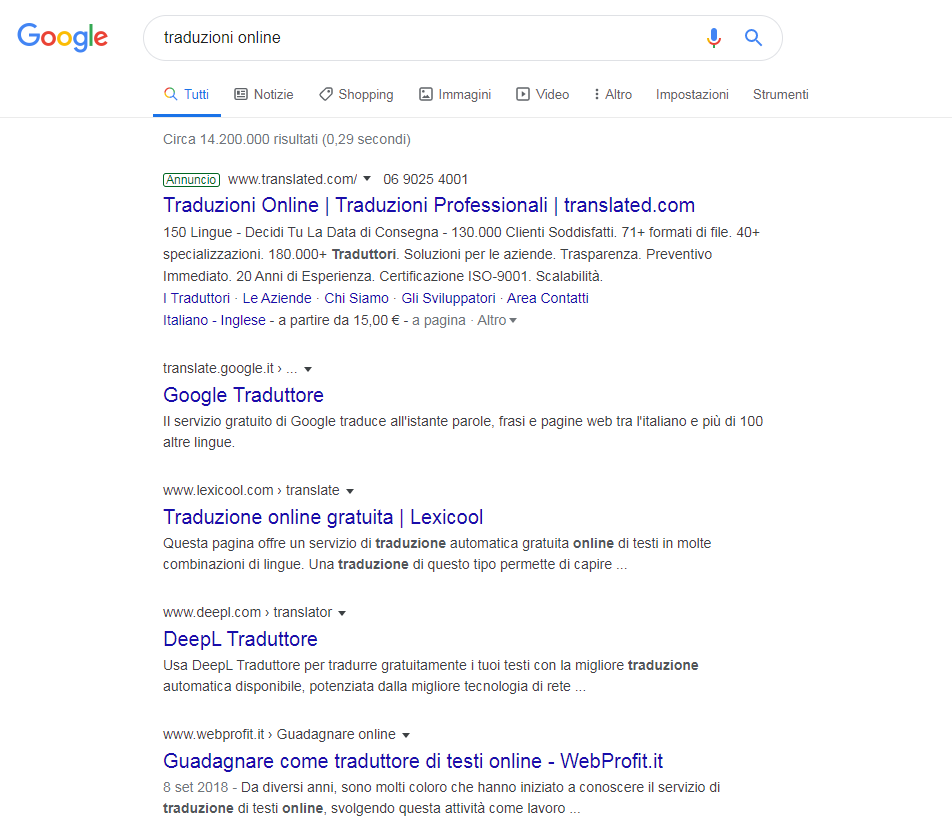
Google desktop, the ongoing graphical experiments
Favicons disappeared! This is the surprise we got in the past few days, navigating Google from desktop: ten days after the announcement of the new look of the Research, the layout has been already overturned again, with the blatant difference of the site’s ID image absence. But a tweet by @searchliaision explains what is actually going on.
Google changes its desktop design once again
“Last week we updated the look of Search on desktop to mirror what’s been on mobile for months“, writes Danny Sullivan su Twitter, adding that the US company has “heard users’ feedbacks” and is then willing to “experiment with new placements for favicons“, in the perspective to always improve the Search system.
A modern touch to the Research layout
The test started last January 24th, on the US search engine first – as always, and could produce some collateral effects during the weeks to come: some could not see favicons at all, while some other might find them on a different placement, since Google is trying to give a modern touch to the desktop.
No more favicons, Ads are now back to green
At the moment, the consequences we noticed on the italian SERPs layout are mainly the disappearance of favicons, while for Google ADS the green box is back instead of the bold black inscription previously added.
A choice, the one concerning ads, that seems to be tied to all the controversies emerged within the SEO community about how easy it was to confuse the AD inscription and a favicon, and therefore about the difficulty of a common user to discern between an organic or paid result (given the fact that even for experts sometimes it seems difficult to identify organic results…). Google seems to be taking a step back, on this side at least.
Negative feedbacks on the new look
As Barry Schwartz reminds us on searchengineland, when Google changed the mobile research’s look “the SEO and SEM community was not that happy about the edits”, and the whole situation has got worse with the new desktop layout. Lots of articles and negative comments were spent for the design, also coming from simple Google users, so the company decided to intervene (even if we still do not have a clue on what will be the actual final version).
Checking the traffic to figure out how CTR changes
What really matters, from a SEO perspective at least, is that aesthetical changes can affect click-through-rate both for Google Ads and organic results, so it is always good to keep ourselves updated on Google’s experiments and solutions, even compared to the way snippets are displayed, so to verify in real-time how the traffic toward our site is truly reacting.


