Core Web Vitals still overlooked: site optimization tips
There are now less than 6 months to the start of the Page Experience Update that, as announced by Google in recent weeks, will officially become a ranking factor from May 2021, but the sites seem to be still far behind in the optimization work. According to an American research, in fact, less than 15% of the sample analyzed meets the benchmarks and exceeds the evaluation criteria on the experience provided to users: here are then a series of indications and advice to improve the performance of the pages and prepare for this “revolution”.
The study on Core Web Vitals and sites today
Providing an account of this analysis is Matt Southern on Search Engine Journal, which reveals that only “a decidedly small percentage of websites is able to pass an assessment of Vitals Core Web within Pagespeed Insights”.
To be precise, looking at the overall parameters of the first three Core Web Vitals indicated by Google only “12% of results on mobile devices and 13% on desktop have passed the evaluation”, although site performance is a bit better “when it comes to meeting benchmarks for a single factor”.
Results of the analysis: issues for visual stability and loading speed
Specifically, for the First Input Delay “99% of desktop Urls and 89% of mobile Urls meet the benchmark of 100 milliseconds”, and this “is a good sign for users, as it means they will be able to interact immediately with almost any page they arrive on”.
More problematic the other two parameters: for the Largest Contentful Paint “43% of Urls for mobile devices and 44% of desktop Urls pass the evaluation” and then loads the main content in less than 2.5 seconds. For the Cumulative Layout Shift they exceed the rating of 0.1 “46% of mobile Urls and 47% of desktop Urls”.
This means, then, that “most of the pages on which users land takes more than 2.5 seconds to load and shows unexpected layout changes“, thus providing a non-optimal experience to people, who must “wait for a page to load while the content swings up and down the screen”.
Where to focus the efforts
Core Web Vitals, as we know, are indicators that measure the quality of the browsing experience and that have been introduced to give a reference to sites on the “page experience” level offered, with the aim of constantly improving the quality of people’s experience on the Web, which should always be “useful and enjoyable”.
What emerges from the study is that currently the most critical areas seem to be LCP and CLS, and therefore speed and stability of the layout are the aspects on which to focus efforts and interventions.
For SEO, however, there are also other aspects to consider: even “if your site does not meet the benchmarks of web vitals today, it does not mean that it will not be ranked at all,” the article emphasizes, because “the search is complex and the Core Web Vitals are only three of the many factors that Google takes into account when classifying pages”.
What remains a priority at the moment – and probably also with the new ranking factor from May 2021 – is the content, its quality and its relevance to the query and search intent: “A more relevant page will usually win on a faster page, but with less relevant content,” concludes Southern.
How to optimize the site for the Page Speed Update
Enter more details of the site optimization tips for this great change another in-depth study on Search Engine Journal (from which the following images are taken), edited by Rachel Costello, that identifies seven aspects of the page experience for the user to focus our attention on, such as ways to ensure faster and smoother visual loading, improve mobile usability and offer greater site security.
The new Page Experience ranking factors
First, it is worth remembering which will be the different elements that will help to determine the overall experience of a page. It is Google itself to clarify from May 2021 that algorithms will evaluate for positioning purposes also:
- Core Web Vitals. The three key metrics to assess performance, which measure the visual loading, interactivity, and visual stability of a page during loading for users.
- Compatibility with mobile devices. The ability of a site to be mobile friendly, and therefore its ease of use and navigation on mobile devices, including the readability of the content and whether the links and elements of the page are clickable and accessible.
- Safe navigation. Assess whether a site has issues such as malware, phishing, and compromised content, to ensure that users can safely navigate.
- HTTPS. It focuses on whether a website connection is secure and whether or not the website is served via the recommended HTTPS protocol.
- Non-intrusive interstitial. Ensures that crucial page content is not blocked for users while browsing.
7 interventions to optimize the site for Page Experience
So here are the advice of Rachel Costello to get us ready for the next May appointment, but not only: the improvement of the experience on the page can have positive effects both in the short and long term, because it will ensure that our users can experience quality on our pages.
This work is not only about meeting certain criteria for search engines, but the attempt to provide the best possible experiences for real users, which should be a priority goal for any site.
- Preload key resources to accelerate visual loading times
One of the first indicators for a user that a page is loading is the appearance of above the fold content. This is where the Largest Contentful Paint (LCP) comes in, the first Core Web Vitals metric to measure the speed with which the main element is loaded on the page.
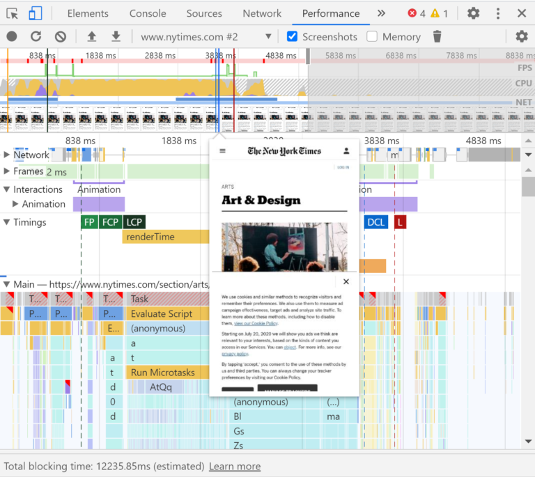
To identify what is the LCP element of a page you just need to inspect the page in Chrome Devtools and view the cascading chart in the Performance tab. After identifying the item, the same tool offers an easy way to view the visual advancement of the loading speed, profiling the page during the process and providing a screenshot of how it loads over time.
Chrome DevTools ‘Screenshots’ feature
This will help us to find out the loading speed of the different elements of the page.
To accelerate the loading of the LCP element and content above the fold, Costello suggests to consider using methods such as preloading to instruct the browser to first recover these resources as a priority.
- Optimize main thread activity by minimizing long tasks
There are many different issues behind the scenes that can cause a user to have to wait for the browser to respond after clicking or tap on a page: this is what is measured by the second Core Web Vitals metric, the First Input Delay (FID).
This is an experience that can be frustrating for users, but there are things we can do to solve the problem and reduce the waiting times between human interactions and browser responses.
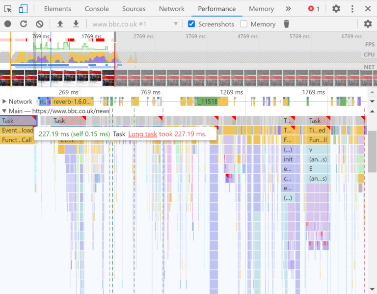
Long tasks are one of the most common “culprits” of this problem: essentially, they are pieces of Javascript code that block the main thread over a long period of time and cause the page to freeze and not respond.
The long tasks in Chrome Devtools are located at the top of the cascade chart in the Main tab and are highlighted with a red triangle; clicking on a long task and going to the Bottom-tabUp, we will see subdivided the different activities that occurred within the activity, such as compilation and analysis of scripts.
The correction required will vary depending on the tasks that contribute to the main thread blocks, but a common solution for solving long tasks is splitting the code and processing scripts into smaller blocks.
- Reserve space for uploading images and embeds
The third Core Web Vitals metric, the Cumulative Layout Shift (CLS), examines the amount of movement of the visual layout of a page during its loading and measures a frustrating aspect of UX that we have all probably experienced: we plan to click on a particular link, but the page moves and we end up accidentally clicking on a different area of the page.
One of the most common causes of a high CLS score, and therefore of a poor UX, is not to reserve spaces for uploading embedded images and resources.
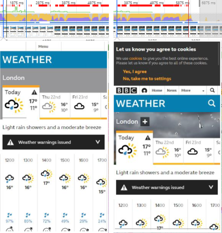
In the example provided by the article, the screenshot function of Chrome Devtools in the Performance tab shows “that the cookie consent banner of BBC Weather does not have a space allocated for loading”; so, once uploaded, “pushes the visible content lower in the viewport around the 3-second sign”. Instead, a space must be provided in the page structure, so that its layout remains unchanged even at the end of the loading of the resource.
- Verify that key page templates are mobile-friendly
Since mobile traffic exceeded desktop volume in 2016, it has become critical to ensure that websites are optimized for mobile devices with which a growing number of users are actually browsing.
The layout and usability of a website on a mobile device can decide the fate of the user experience: for instance, says Costello, “users should be able to see important content in a clear and accessible way, without having to zoom in”.
There are two main ways to evaluate website usability on mobile devices: the first is to monitor the Mobile Usability report in Google Search Console (which will signal issues such as content that does not fit the screen and text too small, as well as showing us a list of Urls interested in each problem) and run key page templates in Google’s mobile optimization test, which is a good way to check individual pages.
- Audit for site security
Other than loading performance and mobile usability, site security also plays a role in determining the page experience.
Google pushes to “make sure that websites presented in Serps are safe for users to browse without the risk of security issues” such as malwares, unwanted softwares, phishing and deceptive content.
An easy way to check if our site presents problems that could put users at risk is the Security Issues report in the Google Search Console.
- Verify that forms and embedded resources are served via HTTPS
Embedding HTTPS as a page experience signal is another way in which Google is trying to ensure the safety of users while browsing.
Posting content that requires user interaction and input on an insecure HTTP connection poses as a risk to users and makes them (and their data) more vulnerable.
This aspect is to be remembered especially for forms in which users enter personal information, such as checkout where payment information is shared.
Performing an SEO security audit allows us to verify the presence of these problems, and even inside our SEOZoom there is a specific tool to find out if the site has “mixed content”, or content with a combination of page resources served on both HTTP and HTTPS.
- Check that interstitials do not obstruct crucial content
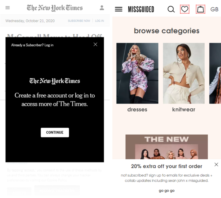
If a site has intrusive interstitials taking up a lot of space on a page and making it difficult for users to access important content, this can create negative and frustrating experiences.
An example of an intrusive interstitial on the left, next to a non-invasive pop-up on the right
By manually examining pages on different devices or still using the screenshot function of Chrome Devtools allows us to view how interstitials could impact our users.
Our goal must be to avoid interrupting users’ browsing experiences: we can evaluate the possibility of redesigning popups and interstitials so that they do not obstruct important content on the page, as well as intervene to allow people not to have to manually close these ads in order to continue their journey on the site.


